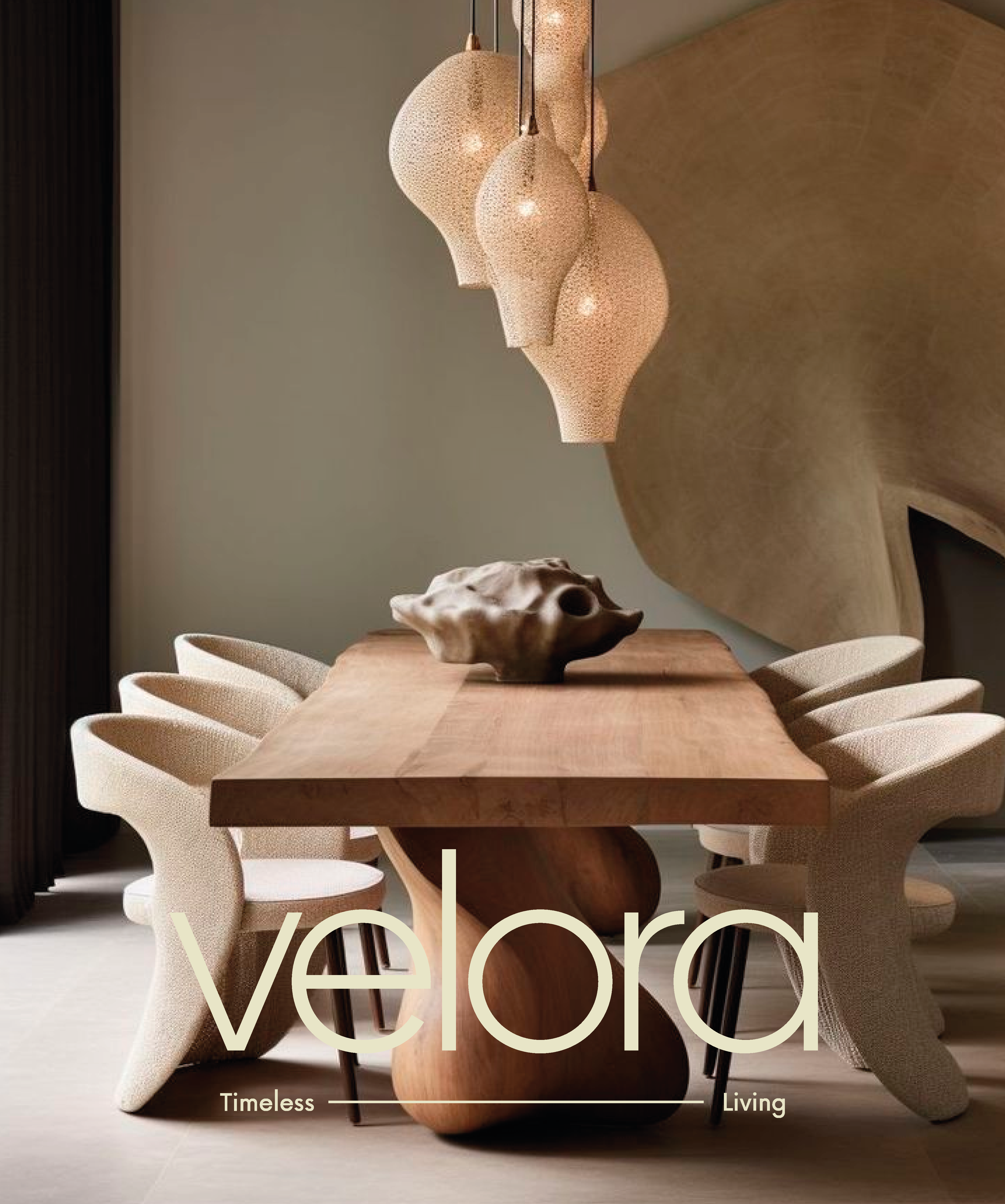
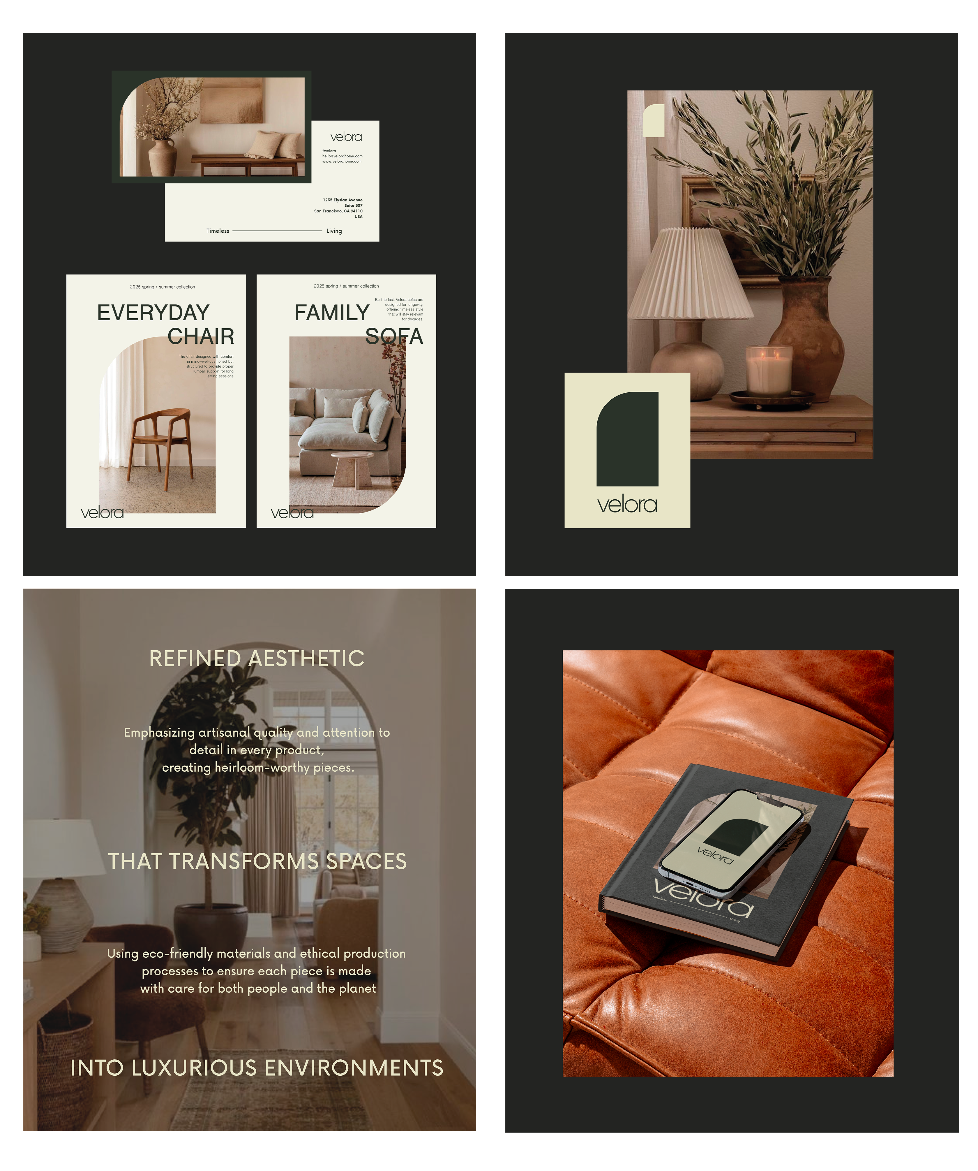
ABOUT THE PROJECT
Velora is a Luxury Home Décor brand offering elegant, timeless furniture, décor items, and accessories designed to elevate any living space. Velora focuses on superior craftsmanship, exclusive designs, and materials that speak to both luxury and comfort.
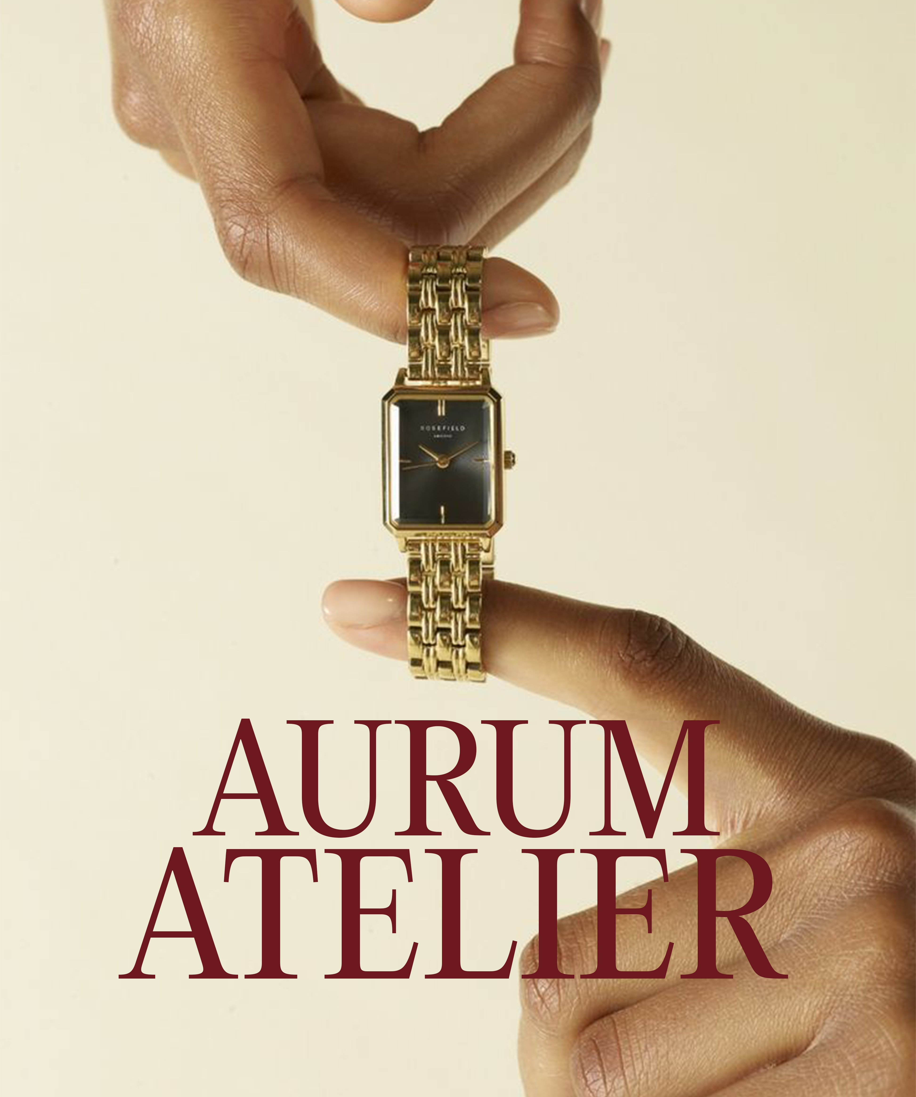

ABOUT THE PROJECT
Aurum Atelier is a luxury Handcrafted Timepieces high-end watch brand that fuses traditional watchmaking craftsmanship with modern, artistic detailing. Each timepiece is designed for those who appreciate exclusivity, precision, and timeless elegance with a unique, contemporary twist.
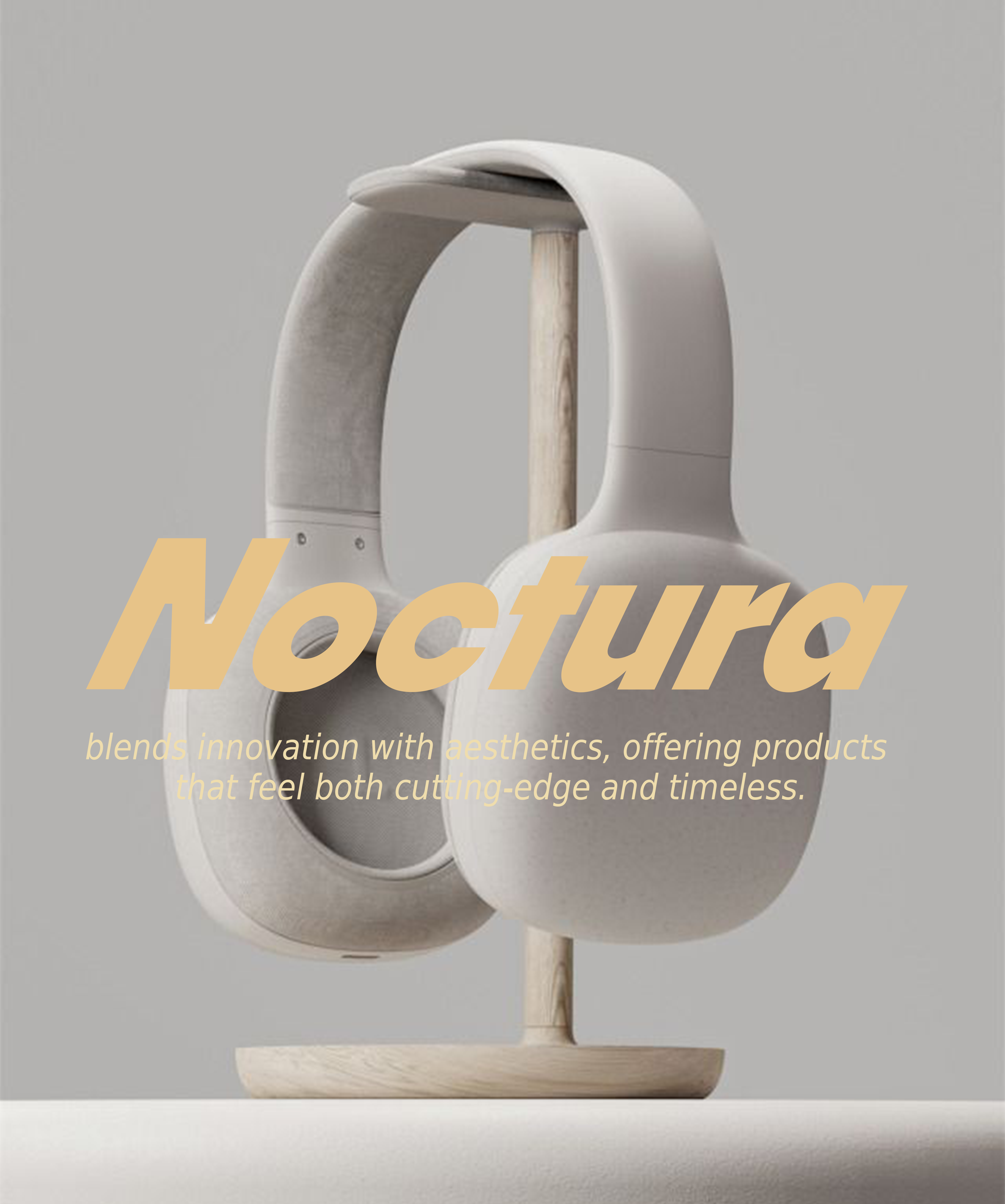

ABOUT THE PROJECT
Noctura a tech accessories brand specializing in sleek, high-performance accessories like smartwatches, wireless earbuds, and minimalist tech gear designed for modern urban life. Noctura blends innovation with aesthetics, offering products that feel both cutting-edge and timeless.
ABOUT THE PROJECT
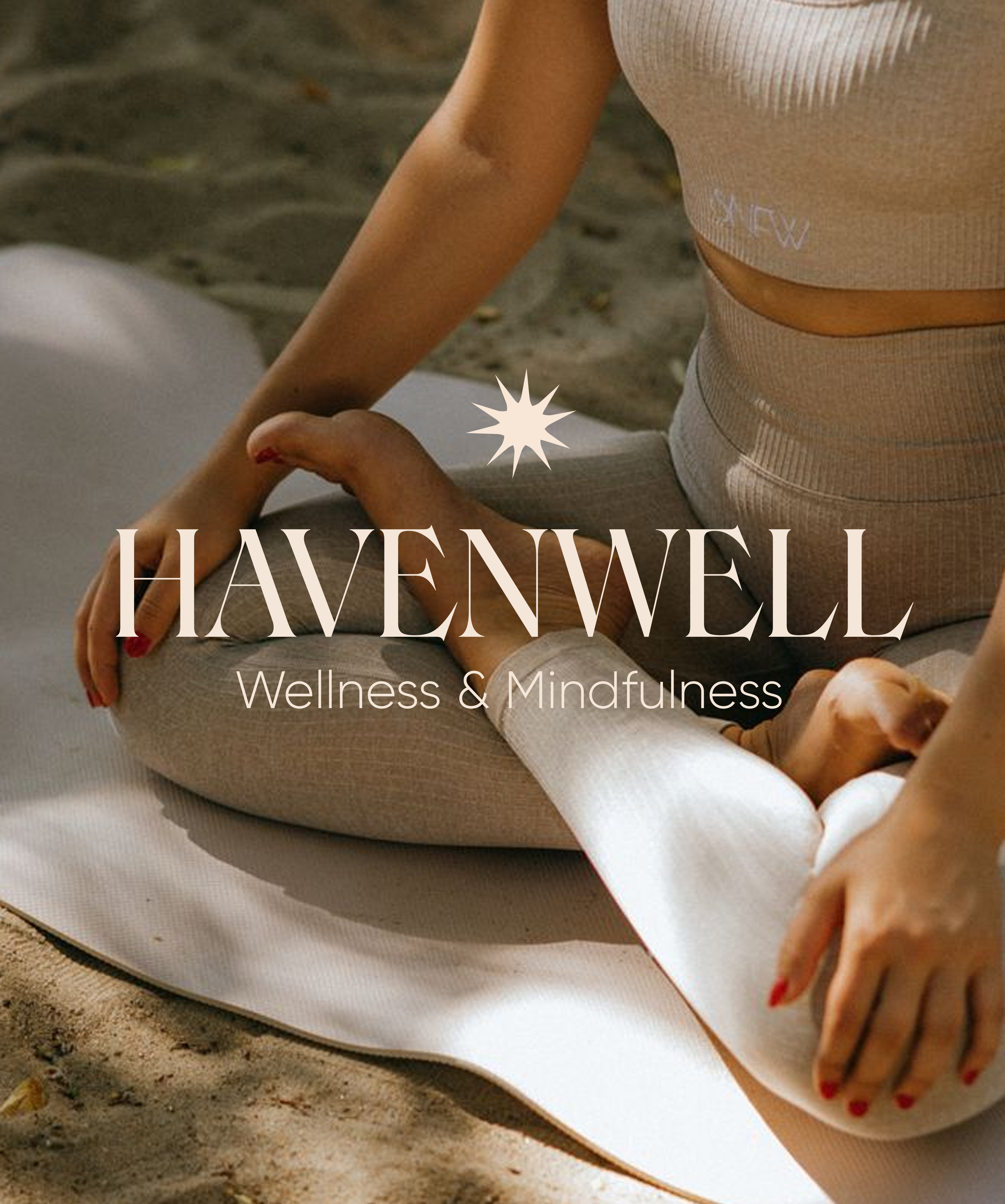
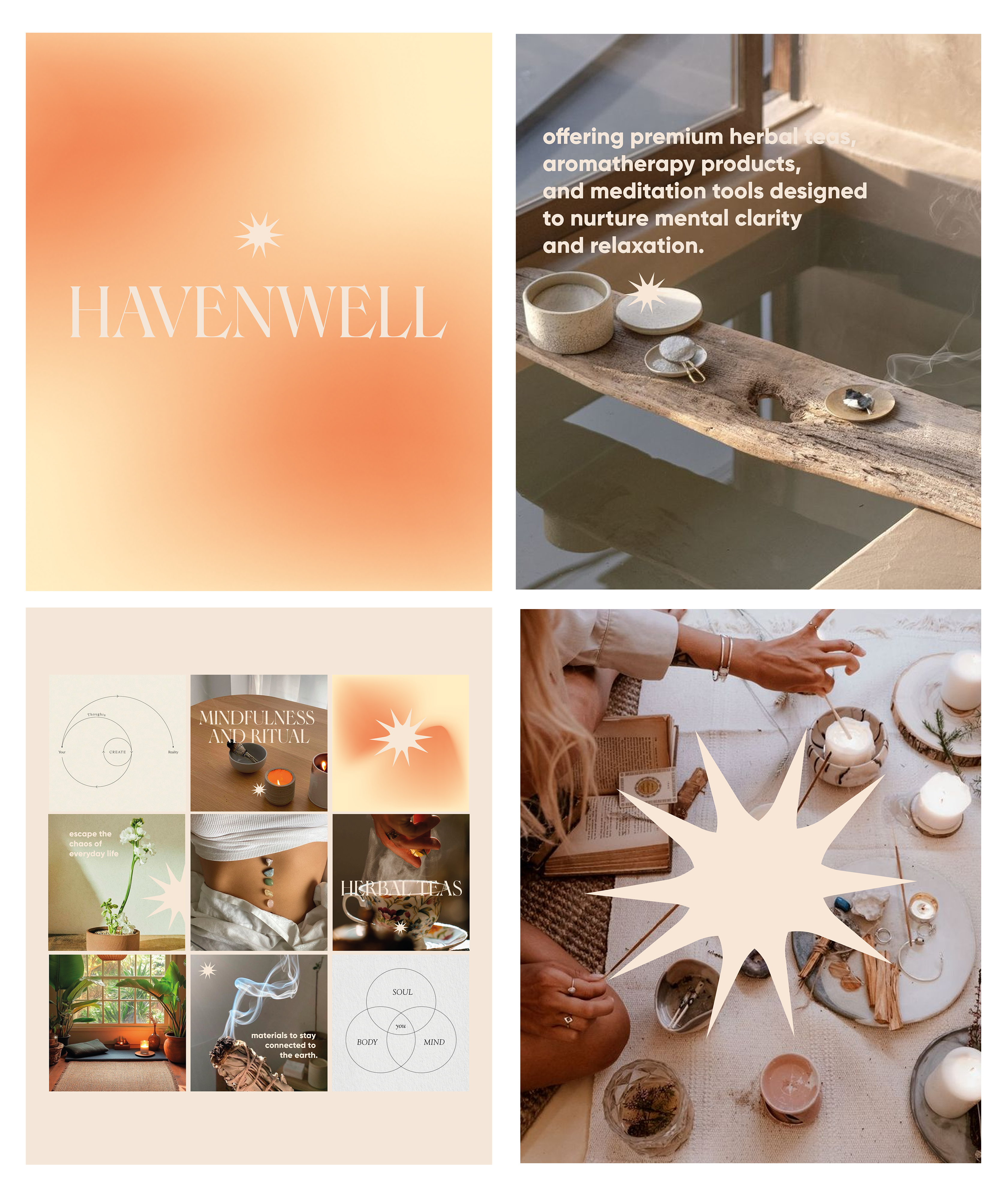
Havenwell is a brand offering premium herbal teas, aromatherapy products, and meditation tools designed to nurture mental clarity and relaxation.

ABOUT THE PROJECT
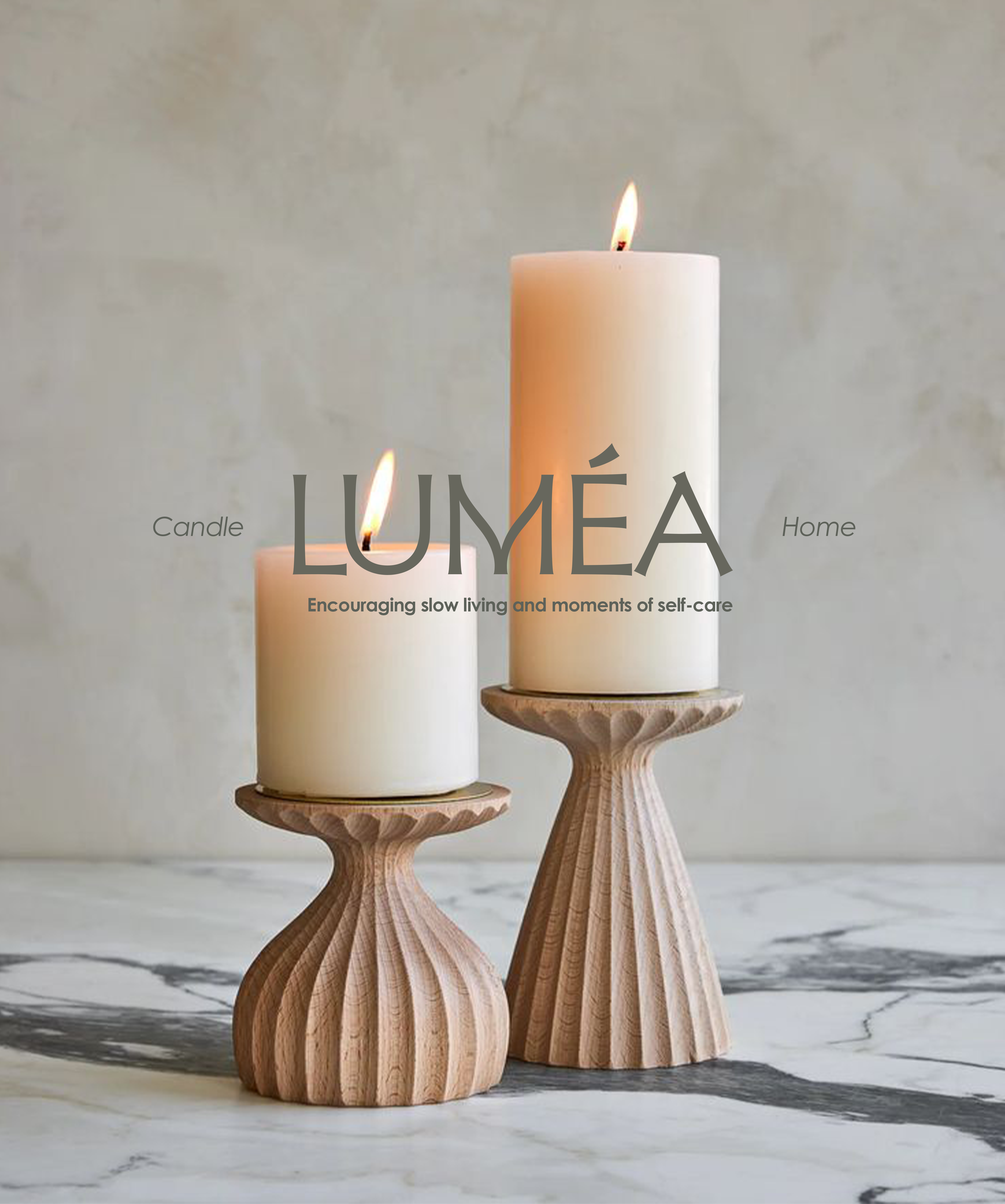
Luméa is a modern candle and fragrance company. Luméa creates handcrafted, sustainable candles and diffusers that use natural ingredients and are designed to bring warmth and serenity to any space.


ABOUT THE PROJECT
Terraflow is a eco friendly outdoor gear brand for the people who love hiking, camping or other outdoor activities while minimizing their ecological impact.
ABOUT THE PROJECT
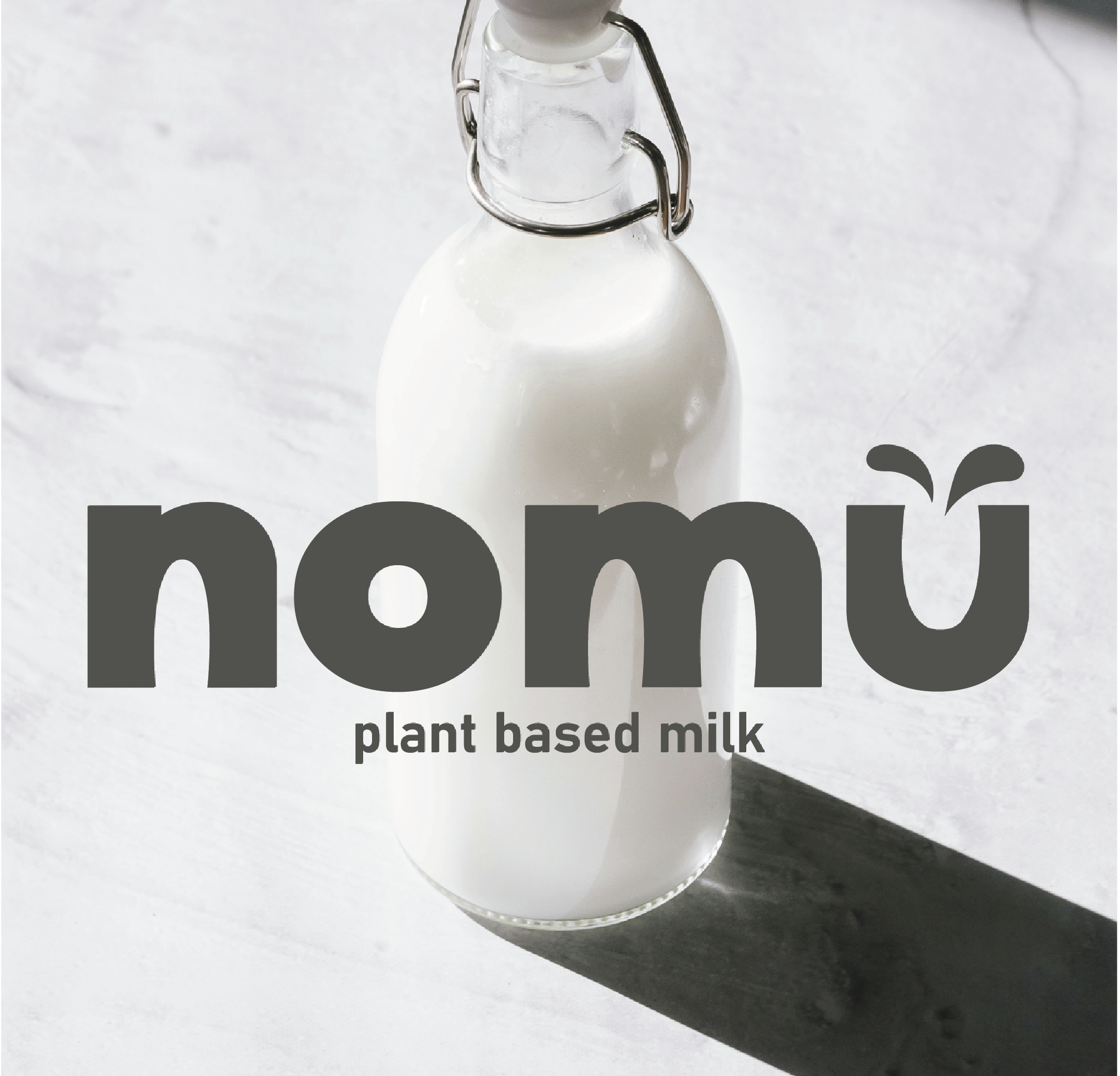
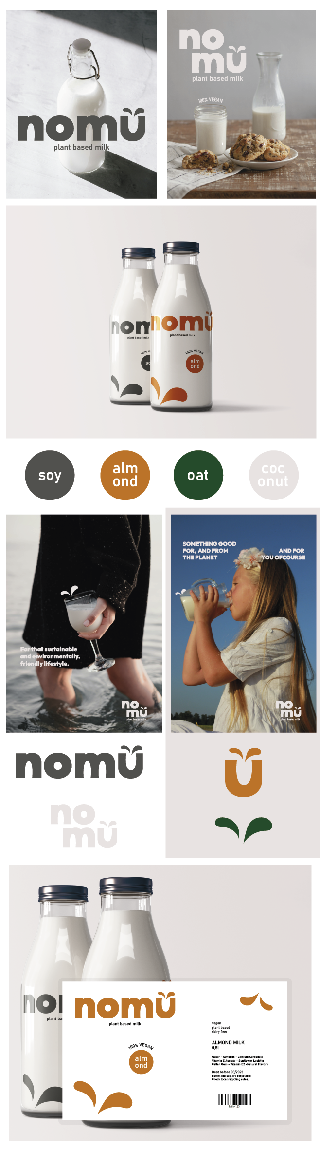
Nomu is a brand in the plant-based milk industry, delivering high-quality, nutritious, and delicious milk alternatives that also promote a sustainable and environmentally friendly lifestyle. The minimalist design of the bottle makes the product more sustainable to produce. The small drops reference the milk drops that spill when you pour the milk into a cup (U). They also symbolize plant leaves, representing the plant-based nature of the product.
ABOUT THE PROJECT
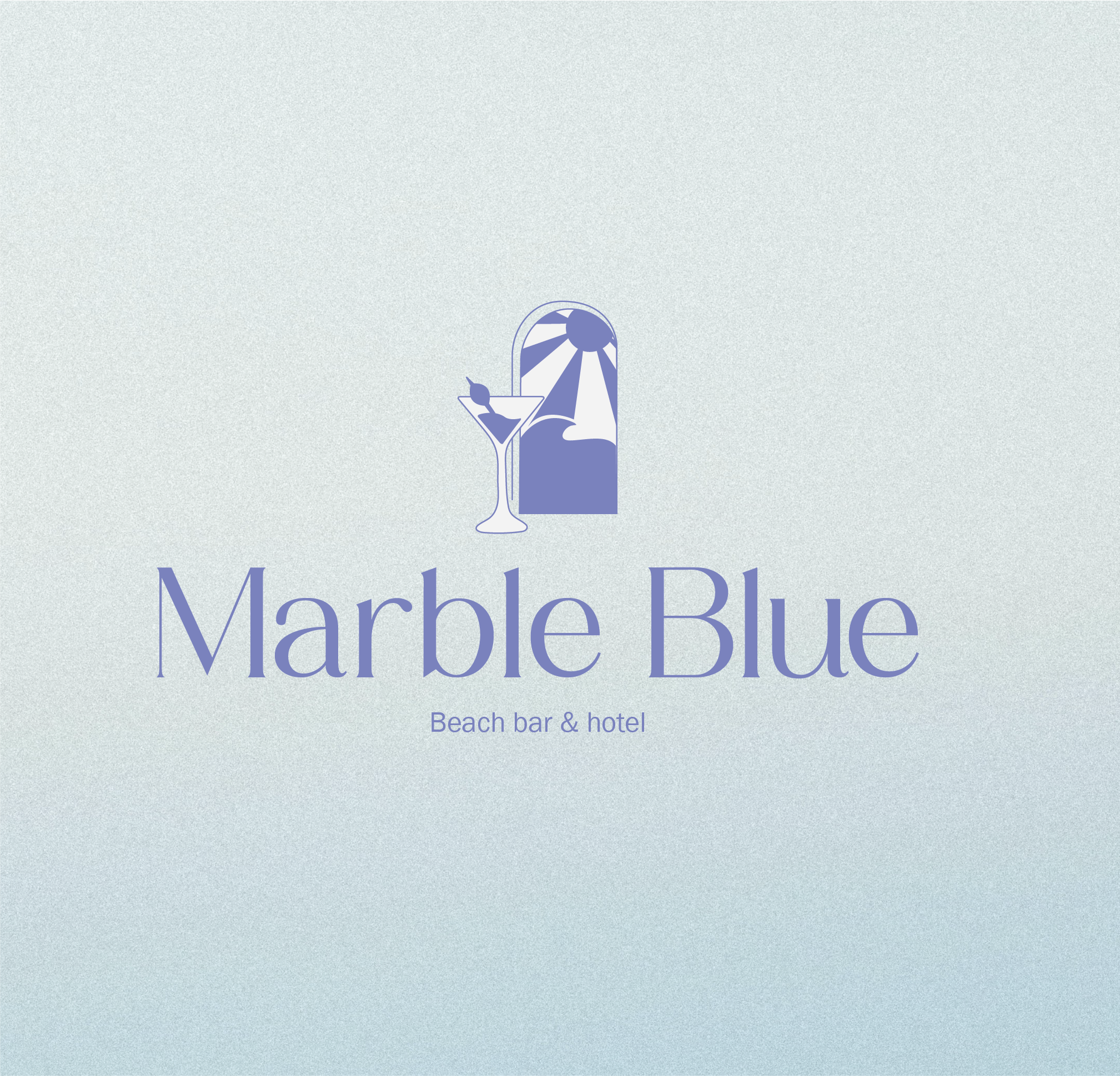
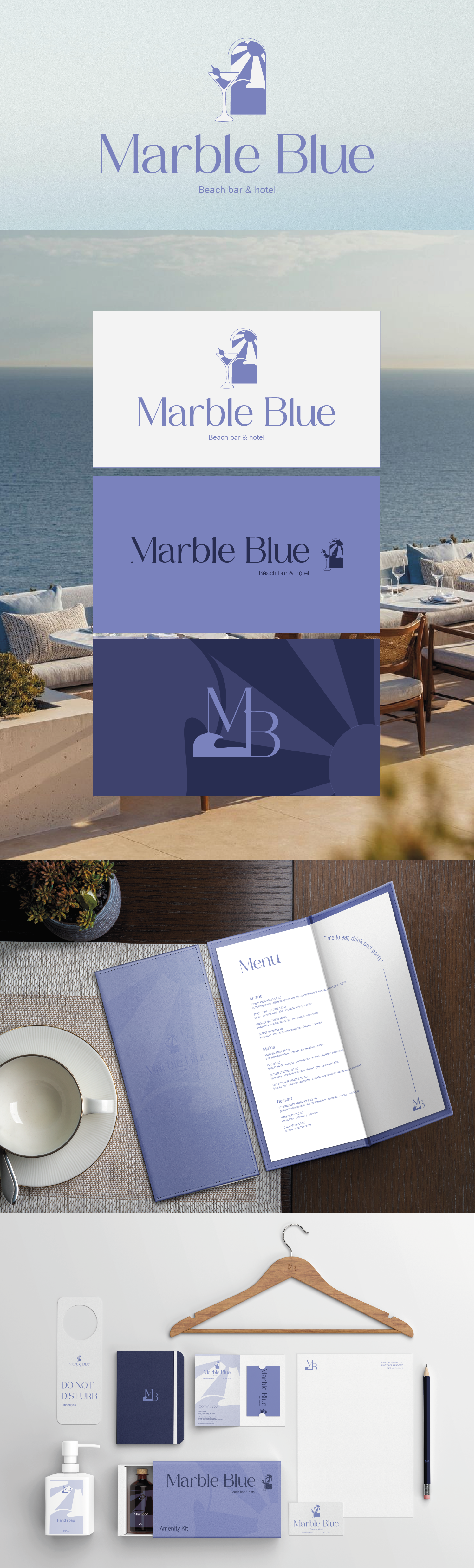
Marble Blue is a beach bar and hotel. Their new branding reflects a calm, sophisticated, and coastal aesthetic. The branding features a minimalist logo with a combination of symbols. The color palette revolves around soft blue and white tones, representing the ocean and sky, creating a serene and elegant vibe. It gives a luxurious and cohesive feel, emphasizing relaxation and premium hospitality at a seaside location.
ABOUT THE PROJECT
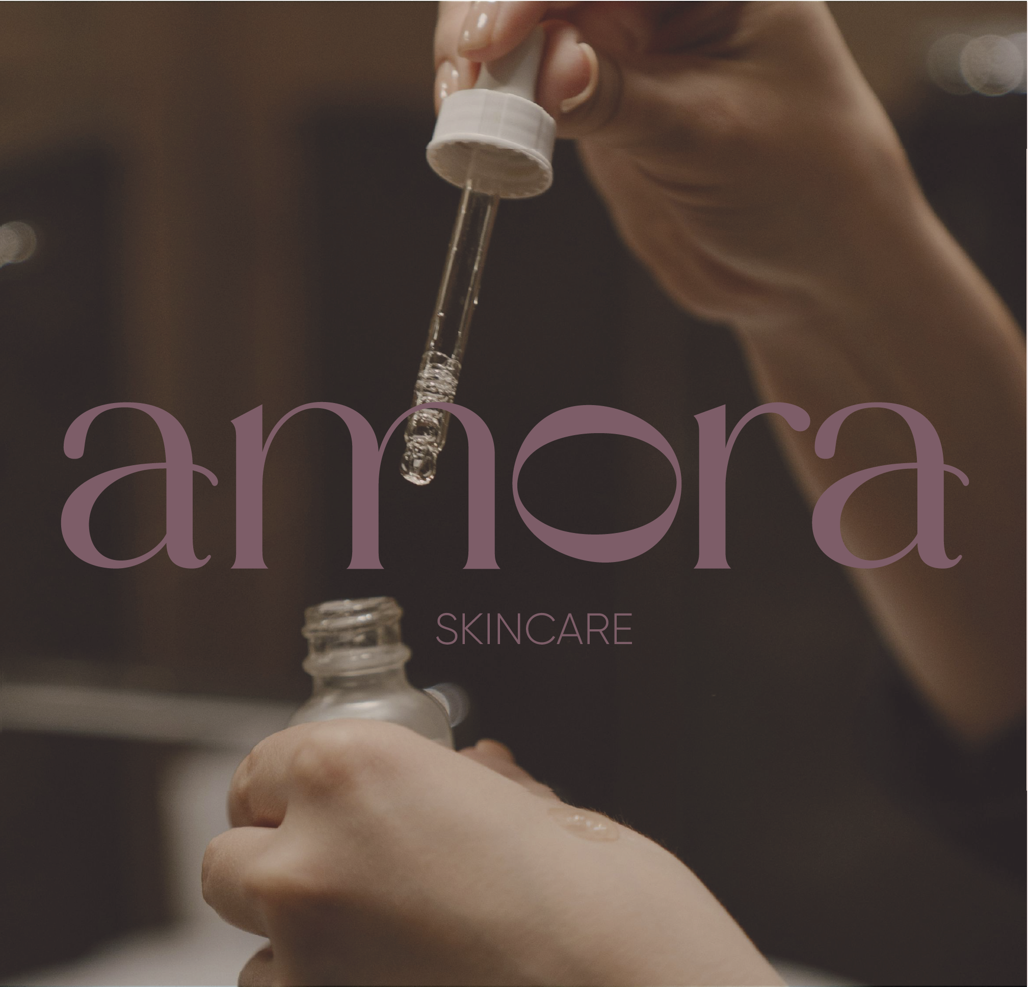
Amora is an all-natural skincare brand that emphasizes the use of natural, non-toxic, and clean ingredients. They prioritize formulations that are free from harmful chemicals like parabens, sulfates, synthetic fragrances, and dyes. The name ‘Amora,’ meaning love, is reflected in the soft color palette used, combined with a romantic serif font for the main branding.
LETS WORK TOGETHER!
